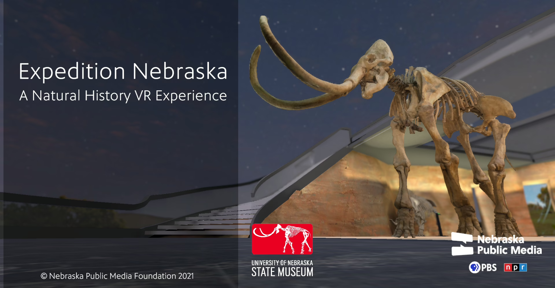
In collaboration with the University of Nebraska State Museum, Nebraska Public Media Labs presents Expedition Nebraska. This 3D interactive experience features two levels of exhibits about Nebraska’s natural history, set in an open air courtyard amidst the Nebraska Sandhills.
From the product description
About the Experience
When you think about museum-based VR experiences, you might not think to search for Nebraska. In general, university museums often get less press and attention than the big city ones. I know from living in different university towns, that local elementary and high school students are generally familiar with these institutions, but they may not be as well known in nearby cities.
Nebraska is a mid-west state with a wealth of prehistoric history to draw on. Like other museum apps, Expedition Nebraska brings you close-up to the exhibits where you can study the information cards, read things at your own leisure, and just generally learn without pressure. I enjoy checking out smaller museums since they often have a personality to them that bigger ones don’t. I was happy that I took the time to install and experience the University of Nebraska State Museum.
Graphics and Sound
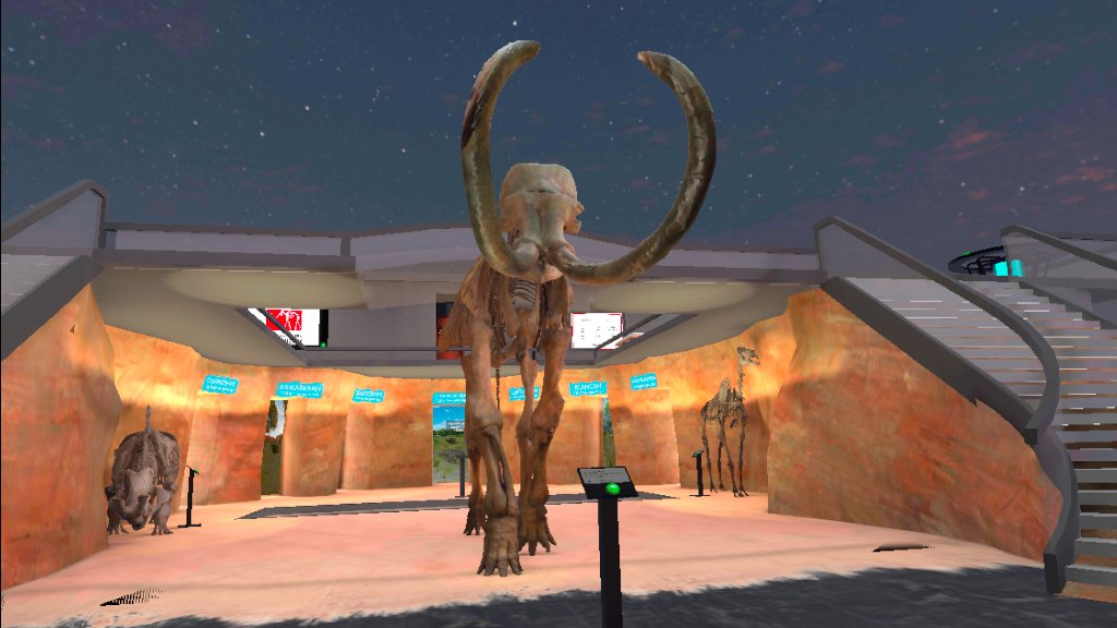
The graphics do the job, even if a little dated. The information site states that the VR app was created using a 2020 version of the Unity engine. That may sound hopelessly old, but it’s actually only two years behind the current stable versions. Still, I suspect that the 3D models and environments were selected/designed to run reasonably well on the available headsets at the time. Updating their Unity version and making some changes here and there to take into account current headsets would likely improve things a bit. Mostly though, the look and feel just reflects a labor of love. It’s not intended to be a realistic simulation, rather it presents the museum details in an accessible way.
The graphics and sound effects are sufficient to convey the information. Visitors to the museum wouldn’t be able to get as close to history as they can here, so it’s definitely an advantage.
Information Content
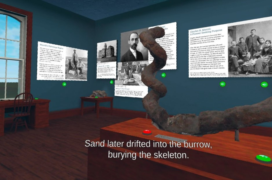
A lot of work went into creating two major exhibits from the actual museum. Rather than try to just recreate the entire museum, they made the choice to focus on two areas. The first area, “The Museum Builders” recreates the original museum space in University Hall. Early artifacts have been 3D scanned so you can see them as though you were there. Each of the elements has written information along with a button to hear an audio version.
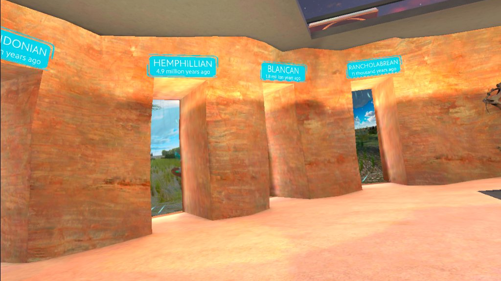
The lower area of the app with the skeletons and sedimentary layers is based on “The Cave of Time” exhibit. This is a recreation of a Dakota sandstone cave. The seven information signs and openings are portals that let you travel back in time where you can see different climates, landscapes, and animals (showing skeletons with overlaid skin).I’m assuming that the actual museum uses dioramas here. It elevates the experience to be able to virtually travel.
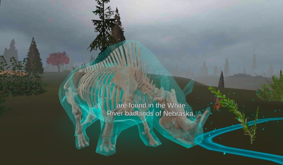
Finally, there’s an area upstairs titled “The Sandhills” that offers details about landscape and how it impacts their aquifers.
Navigation and Interactivity
They did a good job with making it easy to move around, and providing ways to learn about the items. Some items are outlined in teal to indicate that you can pick them up and examine them. There are also buttons to play audio, and even a portal to step into a 360-degree video.
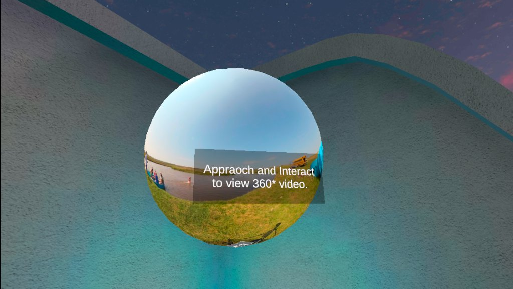
I’m especially impressed by the work that went into accessibility. On smaller projects, it’s easy to overlook the needs of the non-majority.
Specifically, the Nebraska Public Media page calls out captions (all audio is captioned against a high-contrast backdrop), color (tested with filters for the main types of color-blindness), directional audio (audio is fixed to the entity creating it as you turn around), font (designed by PBS with adjustment options).
They also provide options for field of view, inverting the camera control (app only), controller options, camera responsiveness, and movement speed (to reduce nausea).
I love to see this attention to detail and hope to see it more in similar projects.
Updates and Support
The web site states a goal of updates in Fall 2022. I don’t think they happened, so unfortunately, they may have run out of funding.
Summary
I love apps like this. VR needs to be accessible as widely as possible, and these experiences prove that you don’t need to be a major studio to create a title. Take a look at the two exhibits and step back into time. If you’re curious about the world, this is a great title to explore.
Pros
- Clearly created with a passion for bringing natural science to the masses
- Nice selection of museum exhibits
- Versions for WebXR, Android, iOS, and Meta Quest
- Strong consideration of accessibility
Cons
- A few typos, but not enough to detract
- Updates seem to have stopped
