The current exhibition is ‘Rembrandt: Beyond Reality’. Through various portraits, drawings and engravings, we will be able to immerse ourselves in Rembrandt’s technique and discover even the smallest detail of his works.
From the product description
This is the first pre-release title I’m doing a review of. Assuming it gets a full release, I’ll take another look at it. For now, it’s available on the Oculus Store in their App Lab section, so you might come across it and be curious. It’s free while in this state. It appears that it’s their intention to keep it free after release.
About the Experience
MUVA is another virtual museum of art. On the surface, it doesn’t bring much to the table for innovation, although there are a few nice features worth calling out. If these features get more attention by the time they release it, it will make for a nice app.
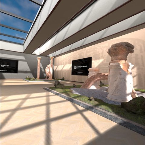
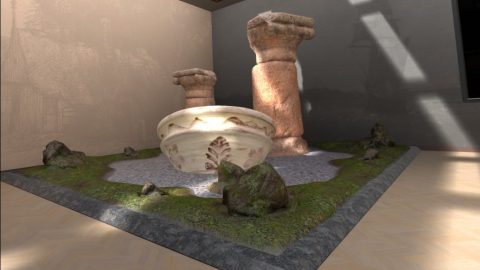
When you first launch MUVA, you’re in a room with various sculptures in the corners. Each wall has a panel with some text (with no apparent function). You can walk around the room, although you can’t step into/onto the sculptures. The four sculpture scenes have no context and seem to be just haphazardly thrown together. At first, I didn’t actually realize there was anything else to do at this point. It turns out that you need to use a controller action button (right controller, A) to perform actions. I don’t love this interaction since it’s just not intuitive. For games, having many physical buttons is important due to the large number of actions needed to be done quickly. For experiential titles, I prefer having controls appear within the world using metaphors like a wristwatch, compass, or arm band.
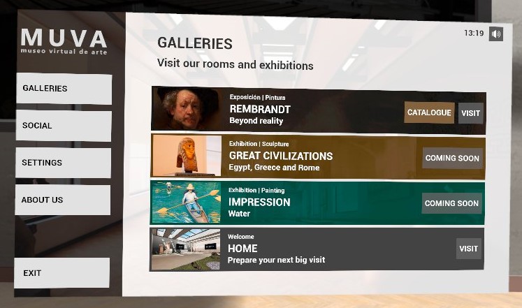
Once you activate the menu, you can see that there are several galleries/exhibits, although two of them are not available yet (Great Civilizations: Egypt, Greece, and Rome, and Impression: Water). Due to the Oculus Quest headsets being more resource-constrained (lower memory and generally lower power) allowances must be made to reduce the processing demands so perhaps it takes more time for them to get everything ready. From the developer’s web site, it appears that there is a version you can download for Vive or other PC-based headsets and these might be available there.
Overall, the experience is about walking around (or teleporting) and being able to see artwork up close. The building itself looks nice, and fades easily into the background. The main focus is on the sculptures, paintings, and drawings. It’s not a very large collection, but it’s a decent start.
Another odd thing to point out is the well-done courtyard seen through the windows from the initial space. It seemed like I’d be able to walk around it somehow, but such was not the case.

Graphics and Sound
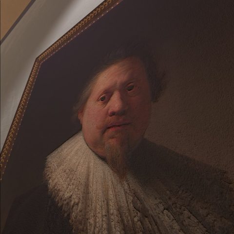
The quality is acceptable. Again, the Quest is limited in what it can depict, although apps like Brink and OtherSight do a great job of pushing it to its limits. You can get up close to the paintings and see the texture, although I’m not convinced that I’m seeing the actual scanned canvas as it looks vaguely rough without an appearance of brush strokes.
The sculptures are similarly adequate. They are probably being displayed at reduced quality compared to their original scan. The random placement of the objects makes it harder to appreciate them too. It would have been nice to have a garden path with columns, urns, and other items used decoratively. Perhaps they could be integrated into the outdoor space and made more approachable.
Information Content
There is spoken narrative for the works in the Rembrandt room. Items or groups of items have a button on the wall that you need to touch to activate it. To me, it seems preferable to be able to use your controller to point (laser beam) and click your trigger buttons to activate these. I could imagine for a person in a wheelchair this could be less than ideal.
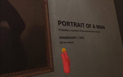
The spoken content is about the same length as what you might read near museum works and provides interesting details. Unfortunately, the main room with sculptures has no plaques or narration buttons so it misses an opportunity.
Navigation and Interactivity
As mentioned above, I’m not a fan of using the A/B and X/Y buttons as they aren’t intuitive and may obscure features of an app. I tend to try everything when I try a new experience. I know there are some people who would look around, see no obvious hints about what to do, and assume they were seeing everything.
Locomotion is accomplished using teleport with the right controller and turning your body (90° snap turns) using the left controller. I really don’t like splitting up locomotion this way. There’s no reason to use both controllers for movement. It just adds more to learn and remember and can lead to frustration.
Updates and Support
The initial release on the Oculus store was in March of 2022. Since it’s in the App Lab section of the store, this indicates that it’s still being tested and is not ready for general use. If you download it, know that it might have some rough edges, but it’s perfectly usable. Binary Box Studios states in their FAQ that they will release new galleries monthly. So far that hasn’t seemed to be the case, but they probably still need a little time to put finishing touches on it.
Summary
Muva has some good potential. For some reasons, most museum experiences seem to release one time and wash their hands of it. If they truly do have an ongoing release schedule for new galleries, it will make this a very good app to watch, especially being free. I hope they reconsider their controls, including teleportation, and also consider changing their initial area to be a little better, but overall, it’s a good start.
Pros
- Nice, though small, curated set of art
- Spoken information for most items
- Potential for additional galleries
Cons
- Odd starting area could use some improvement
- Teleportation is awkward using both controllers
- Menu requires using an action button instead of the menu button
